Sea and Shore Services
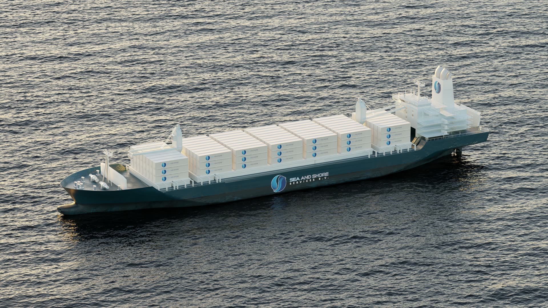
Brand identity worked out in 3D for a logistics company — putting the mark on container ships and container stacks to see how it actually behaves at scale.
Branding for a shipping and logistics company, developed on the objects the brand will actually live on. A container vessel was built and liveried in the company’s deep teal, the mark carried on the hull and repeated across every container on deck, and a separate loop tracks along a stacked wall of containers so the identity can be judged as a repeating pattern rather than as a logo on a page.
A logistics brand does not get seen on a business card. It gets seen at 200 metres from a quayside, half-obscured, repeated hundreds of times across stacked steel boxes, in whatever light the North Sea is offering. None of that can be judged from a flat logo presentation.
Build the objects, then apply the identity and look at it honestly. The vessel is rendered at sea in low sun so the hull mark has to hold against water glare, and the container loop puts the same mark into dense repetition to test what it does as a texture. Both are experiments as much as deliverables — the point is to see the brand fail or hold before anyone paints real steel.
Vessel and container modelling, livery and brand application, shading, lighting and rendering.
Catamaran
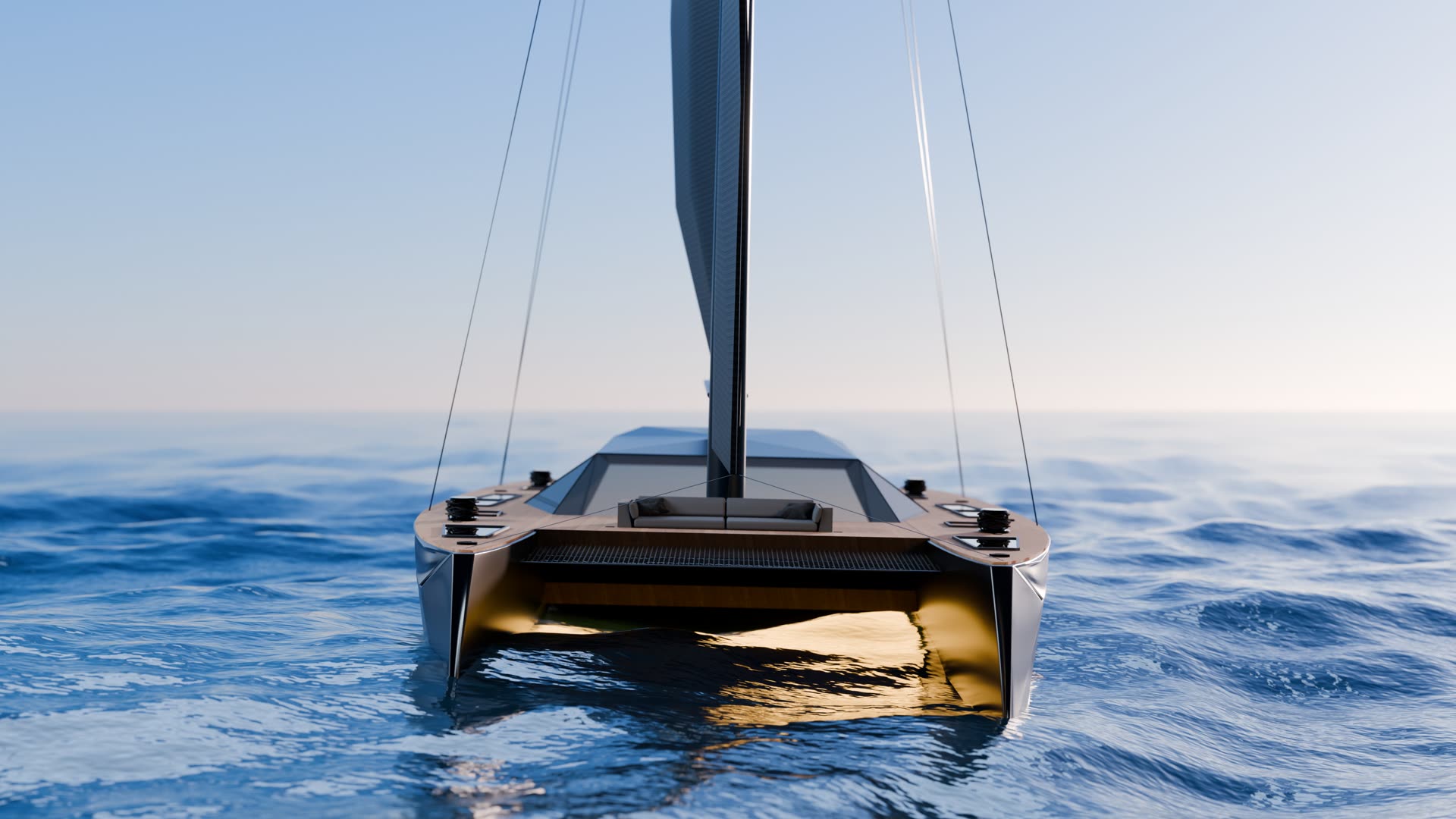
A commercial for a performance sailing catamaran, built to see whether a hull can be sold the way a car is.
View case study →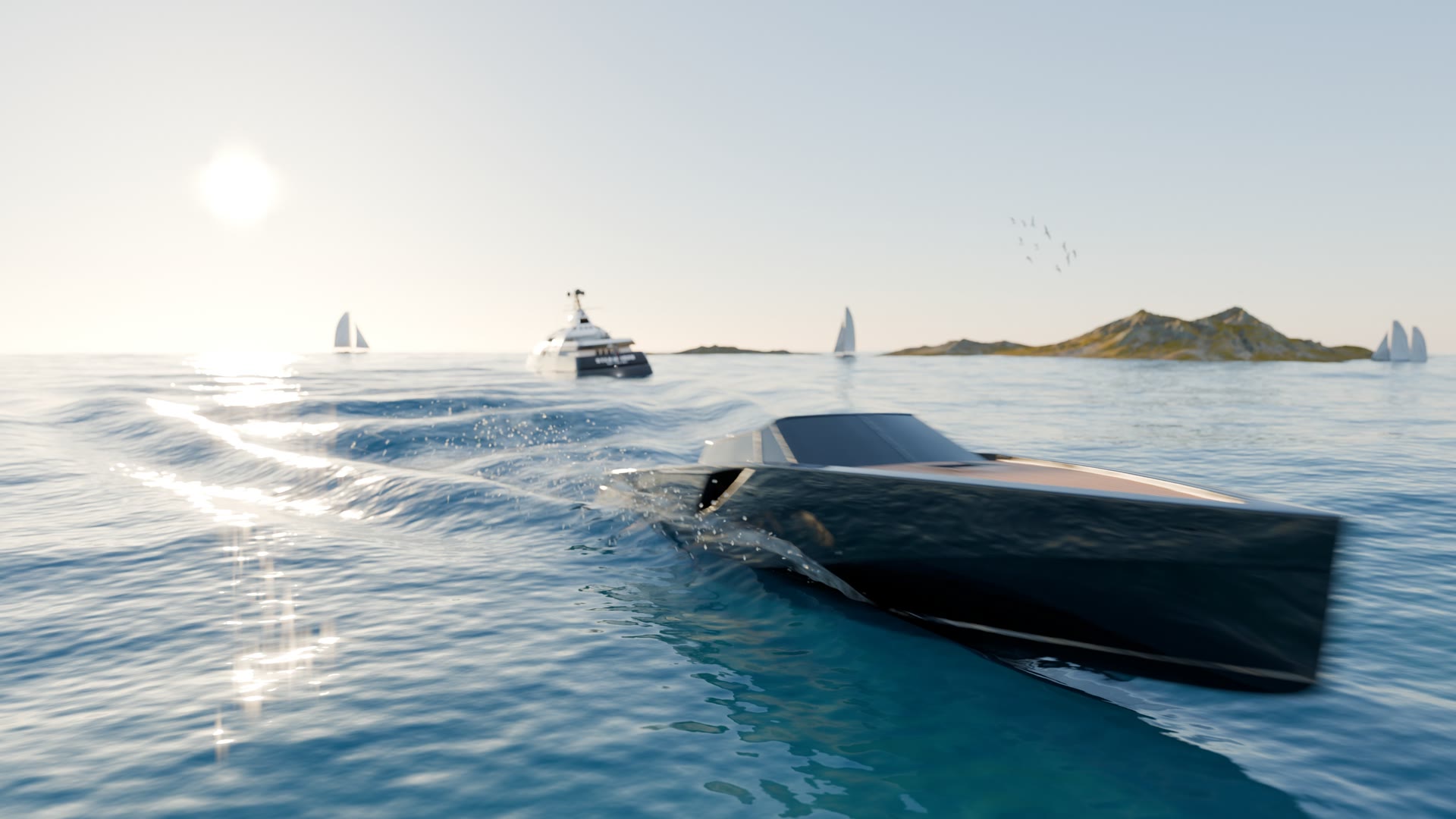
Speedboat
A black-hulled speedboat rendered at speed from every angle — the kind of imagery a boat builder needs long before the first hull leaves the mould.
View case study →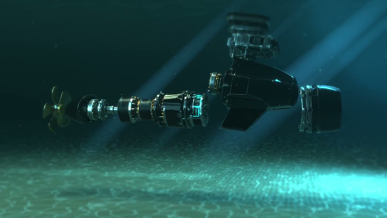
Pod Drive, Exploded
An exploded-view animation of an electric pod drive, taken apart piece by piece below the waterline.
View case study →Tell us what you are making.
Send the brief, the deadline and whatever reference you have. We answer within 48 hours.